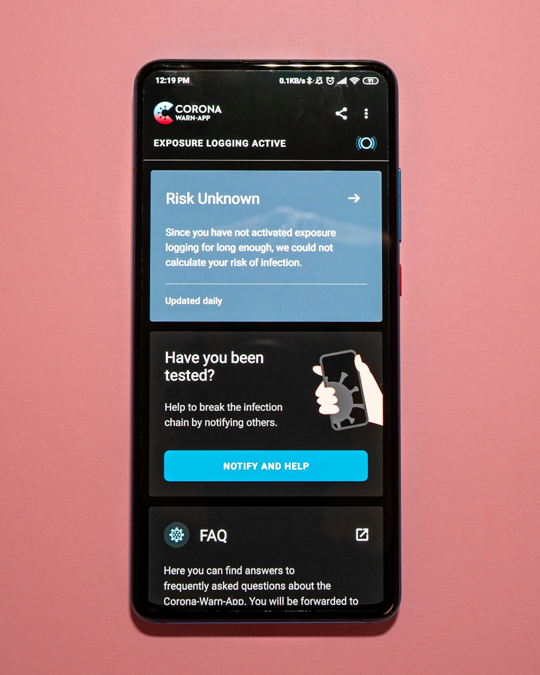
Picture your website as a tiny shop on a busy street. Now imagine most people walk up to that shop while holding a phone. If the door is too small, the sign is crooked, and the checkout desk is hidden, they leave. Search engines notice. That is why responsive design SEO matters so much.
TLDR: A mobile-friendly website is easier to use on phones and tablets. Google rewards sites that load fast, fit the screen, and make visitors happy. Responsive design helps your SEO because it improves user experience, speed, and crawlability. In simple terms, happy mobile visitors can lead to better rankings.
What Is Responsive Design?
Responsive design means your website changes shape to fit any screen. It works on phones. It works on tablets. It works on laptops. It works on big desktop monitors.
The same page bends, stacks, shrinks, and stretches in a smart way. Text stays readable. Buttons stay easy to tap. Images do not blast off the side of the screen like a rocket.
Think of it like water. Pour water into a glass, and it fits the glass. Pour it into a bowl, and it fits the bowl. A responsive website does the same thing with screens.

Why Does Google Care About Mobile?
Because people care about mobile.
Most web searches now happen on phones. People look for pizza, shoes, doctors, dog groomers, and answers to weird questions at 2 a.m. They do it on small screens. Google wants to send them to pages that actually work.
If your site is hard to use on a phone, visitors may bounce away fast. That sends a bad signal. It says, “This page did not help me.”
Google wants helpful pages. So it favors websites that give users a smooth ride.
Mobile First Indexing: The Big SEO Shift
Here is the important part. Google uses mobile first indexing. This means Google mainly looks at the mobile version of your site when deciding how to rank it.
Not the fancy desktop version. Not the giant screen version. The phone version.
So if your desktop site is beautiful, but your mobile site is a mess, that is a problem. It is like wearing a tuxedo jacket with pajama pants. Google sees the pajama pants.
Responsive Design Helps Users Stay Longer
Good SEO is not just about keywords. It is also about people.
When users land on your page, they ask silent questions:
- Can I read this without zooming?
- Can I tap the buttons?
- Can I find what I need?
- Does the page load quickly?
- Do I trust this site?
If the answer is yes, they stay. They click. They read. They may buy. They may contact you. They may even come back later.
These actions can support better SEO performance. A good mobile experience keeps people from running away like they saw a spider.
Fast Sites Win More Often
Mobile users are not patient. They are standing in line. They are riding a bus. They are pretending to listen in a meeting. They want answers now.
If your site takes forever to load, they leave. A slow site feels broken, even if it looks nice.
Responsive design can help with speed when it is built well. It can use flexible images. It can avoid heavy layouts. It can serve content in a cleaner way.
Speed matters because Google uses page experience signals. Fast pages are easier to love. Slow pages are like soup served with a fork.

Better Navigation Means Better SEO
On a desktop, you have room. Menus can spread out. Sidebars can sit there proudly. Big banners can wave hello.
On a phone, space is tiny. Every pixel pays rent.
A responsive website makes navigation simple. Menus collapse. Buttons get larger. Content stacks in a clean order. Users know where to go next.
This helps search engines too. A well organized site is easier to crawl. Internal links are easier to follow. Important pages are easier to discover.
Good navigation is like clear road signs. Bad navigation is like a maze built by a squirrel.
Responsive Design Reduces Duplicate Content Problems
Years ago, some websites had two versions. One for desktop. One for mobile. You may have seen mobile URLs that started with m dot.
That setup can work. But it can also get messy. You might have duplicate pages. You might forget to update one version. You might confuse search engines with redirects and tags.
Responsive design keeps things simple. One URL. One page. One set of content. It adjusts to the device.
For SEO, simple is often strong. Fewer moving parts means fewer chances to trip over your own shoelaces.
Mobile Friendly Design Builds Trust
People judge websites fast. Very fast. Maybe too fast. But they do.
If your site looks broken on a phone, users may think your business is outdated. They may wonder if you are still open. They may wonder if the checkout is safe.
A clean mobile design says, “We are real. We care. You can trust us.”
Trust can lead to more clicks, more calls, more sales, and more shares. Those things do not hurt SEO. They help your online presence grow.
What Makes a Website Mobile Friendly?
A mobile-friendly site is not just a desktop site squeezed into a tiny box. It is designed for thumbs, eyes, and short attention spans.
Here are the basics:
- Readable text: No pinching and zooming needed.
- Tap friendly buttons: Buttons should be big enough for real fingers.
- Fast loading: Pages should appear quickly, even on mobile data.
- Flexible images: Images should resize without breaking the layout.
- Simple menus: Users should find things without a treasure map.
- No annoying popups: Popups should not block the entire screen.
- Clear content: Put the most important information near the top.
Responsive Design and Local SEO
Mobile design is extra important for local businesses.
People often search on phones when they are ready to act. They search for things like:
- “coffee near me”
- “emergency plumber”
- “best dentist nearby”
- “open pizza place”
These users are not just browsing. They are ready to call, visit, book, or buy.
If your site works well on mobile, they can tap your phone number. They can open maps. They can check your hours. They can read reviews. They can become customers.
If your site does not work, they choose someone else. Ouch.
Common Mobile SEO Mistakes
Even good websites can make silly mobile mistakes. Here are some common ones:
- Text is too small.
- Buttons are too close together.
- Images are huge and slow.
- Menus are confusing.
- Popups cover the content.
- Important content is hidden on mobile.
- Forms are hard to complete.
These problems annoy users. They also make your site look less helpful to search engines.
How to Check If Your Site Is Responsive
You do not need to be a coding wizard. Start with simple checks.
- Open your website on your phone.
- Try reading a page without zooming.
- Tap the menu and buttons.
- Fill out a form.
- Check how fast the page loads.
- Turn your phone sideways and see what happens.
If anything feels clunky, users probably feel it too. Fix the awkward parts first.
The Bottom Line
Responsive design SEO is not magic. It is common sense with a technical hat on.
Google prefers websites that help people. People prefer websites that work well on their phones. So mobile-friendly websites often have a better chance to rank.
A responsive site is faster, cleaner, easier to crawl, and easier to use. It keeps visitors happy. It makes your content easier to enjoy. It turns tiny screens into big opportunities.
So give your website a mobile makeover if it needs one. Your visitors will thank you. Google may thank you too. And your thumbs can finally relax.
Leave a Reply