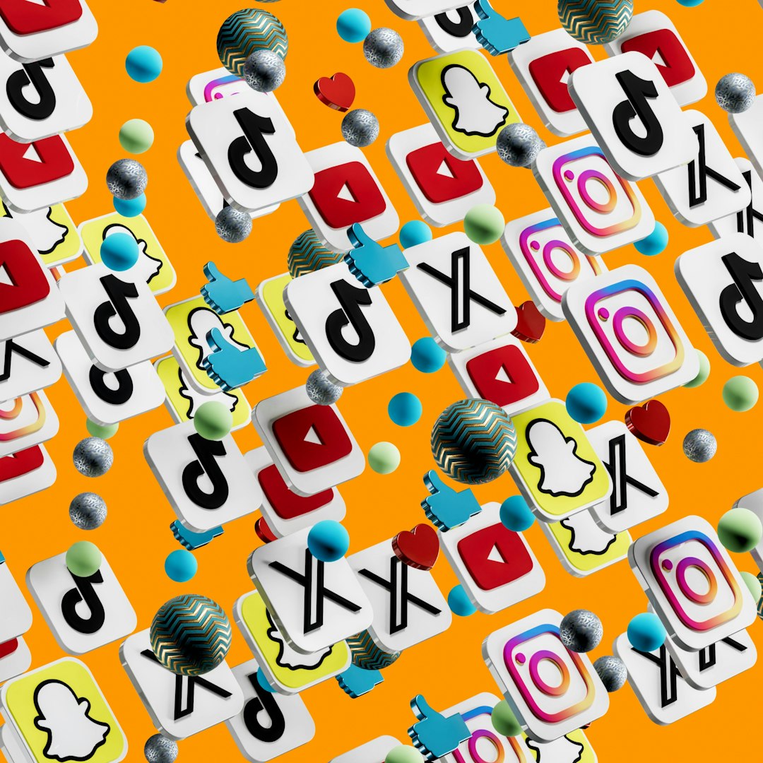
Modern websites are expected to feel polished, fast, and visually memorable from the first click. One small design element that can make a surprisingly big difference is the social media icon. While flat icons are still clean and practical, 3D social media icons add depth, personality, and a premium feel that can help a website stand out in a crowded digital space.
TLDR: 3D social media icons are a stylish way to make modern websites feel more interactive, friendly, and visually engaging. The best icons balance depth, brand recognition, readability, and performance. Use them in strategic places such as headers, footers, contact sections, portfolios, and landing pages. For the most professional result, choose icons that match your website’s colors, spacing, and overall design style.
Why 3D Social Media Icons Are Popular in Modern Web Design
Website design has moved beyond simple decoration. Every visual element should contribute to the brand experience, usability, and emotional tone of the page. 3D icons do this especially well because they feel more tactile and dynamic than traditional flat graphics. They can look like glossy app buttons, soft clay objects, glassmorphism elements, or futuristic floating symbols.
In a world where users scroll quickly and make instant judgments, small visual cues matter. A well-designed 3D Instagram, LinkedIn, YouTube, TikTok, or Facebook icon can encourage users to connect with a brand beyond the website. It tells visitors, “This brand is current, polished, and active.”
What Makes a Great 3D Social Media Icon?
Not every 3D icon is suitable for a modern website. Some are too heavy, overly detailed, or inconsistent with the rest of the design. The best 3D social media icons share a few important qualities:
- Recognizable shape: The platform logo should remain easy to identify at a glance.
- Clean depth effect: Shadows, highlights, and perspective should enhance the icon, not overwhelm it.
- Consistent style: All icons in a set should use the same lighting, angle, color treatment, and size.
- Fast loading: Icons should be optimized so they do not slow down the website.
- Responsive clarity: They should look crisp on desktop, tablet, and mobile screens.
- Accessible contrast: Icons must remain visible against the background, especially in small sizes.
A great 3D icon feels intentional. It should not look like a random decoration added at the last minute. Instead, it should support the visual language of the whole website.
Best Styles of 3D Social Media Icons
There are many different types of 3D icon styles, and the right choice depends on the website’s tone. A creative portfolio may need playful, colorful icons, while a technology startup may prefer sleek glass or metallic effects. Below are some of the most effective styles for modern website designs.
1. Glossy App Style Icons
Glossy 3D icons are inspired by app buttons and mobile interface design. They often feature rounded corners, bright gradients, reflective highlights, and soft shadows. This style works well for websites that want to feel energetic, approachable, and digital-first.
Best for: SaaS websites, mobile apps, startup landing pages, creator portfolios, and digital agencies.
Design tip: Use glossy icons on clean backgrounds with enough spacing. If the rest of the page is already colorful, choose a slightly softer gloss effect to avoid visual clutter.
2. Soft Clay 3D Icons
Soft clay icons have a smooth, sculpted look, often using pastel colors and gentle shadows. They feel friendly, modern, and less corporate. This style has become popular in wellness websites, education platforms, lifestyle brands, and personal portfolios.
Clay-style icons can make social buttons feel less like technical links and more like charming interactive objects. Their rounded shapes also pair beautifully with modern UI cards, curved sections, and minimal layouts.
3. Glassmorphism Social Icons
Glassmorphism uses transparent surfaces, blurred backgrounds, light borders, and glowing highlights. When applied to social media icons, it creates an elegant and futuristic look. These icons can appear like small glass tiles floating above the page.
Best for: fintech platforms, technology websites, Web3 projects, premium dashboards, and futuristic landing pages.
However, glass icons require careful contrast. If the background is too busy, the logo may become hard to see. Use subtle blur effects and make sure the platform symbol remains clear.
Image not found in postmeta4. Isometric 3D Icons
Isometric icons use a fixed angled perspective, giving them a neat architectural feel. They are structured, clean, and excellent for explaining digital ecosystems. An isometric set of social media icons can look especially strong in hero sections, marketing graphics, website footers, and feature panels.
This style is ideal when you want visuals to feel organized and professional, but still more engaging than flat icons. Isometric icons also pair well with illustrations of devices, dashboards, chat bubbles, and analytics screens.
5. Minimal 3D Icons
Minimal 3D icons use restrained depth, subtle gradients, and simple shadows. They are perfect for brands that value simplicity but still want a touch of modern visual interest. Unlike highly glossy or colorful icons, minimal 3D icons blend smoothly into clean layouts.
Best for: personal brands, consultants, architecture websites, editorial sites, luxury brands, and modern corporate pages.
With this style, less is more. The icon should look dimensional without becoming the loudest element on the page.
Where to Use 3D Social Media Icons on a Website
Placement is just as important as style. Social media icons should be visible enough to be useful, but not so dominant that they distract from the main call to action. Here are the best places to use them:
- Header navigation: Good for brands that rely heavily on social engagement, but icons should be small and subtle.
- Footer: The most common and reliable placement. Visitors often look here for social links.
- Contact section: Useful when encouraging direct connection across multiple platforms.
- About page: Excellent for personal brands, teams, creators, and consultants.
- Blog sidebar: Helpful for encouraging readers to follow or share content.
- Landing page hero: Works well when social proof and community presence are part of the brand story.
For most websites, the footer is the safest location. For portfolios, agencies, and creator websites, placing 3D icons near the introduction or contact call to action can increase visibility and engagement.
How to Match 3D Icons With Your Website Design
The best 3D social media icons should look like they belong to the layout, not like they were pasted in from a different design system. To create a cohesive look, pay attention to the following:
- Color harmony: Keep platform colors recognizable, but adjust brightness and saturation to suit your palette.
- Lighting direction: Make sure shadows and highlights match other 3D or UI elements on the page.
- Corner radius: Rounded websites look better with rounded icons, while sharper layouts may need more geometric styles.
- Spacing: Give each icon room to breathe. Crowded icons reduce the premium effect.
- Scale: Icons should be large enough to appreciate the 3D detail but small enough to stay functional.
A common mistake is using icons that are too visually complex for their size. If an icon will appear at 24 or 32 pixels, a simple 3D style is usually better. Highly detailed 3D artwork works best at larger sizes, such as in hero graphics or promotional sections.
Performance and File Format Considerations
Beautiful icons are only effective if they do not harm the user experience. Large image files can slow down page loading, especially on mobile. When choosing 3D social media icons, consider whether they are provided in optimized formats.
PNG files are common for 3D icons because they support transparency and detailed rendering. WebP is often better for performance because it can reduce file size while maintaining quality. SVG is excellent for flat or simple vector icons, but complex 3D effects may not always translate well unless the icon is built with gradients and filters.
For best results, use compressed images, serve properly sized files, and avoid loading large icon sets if you only need a few platforms. A website does not need every social network icon available. It only needs the platforms that are relevant to the brand and audience.
Best Platforms to Include
The ideal set of social icons depends on your business, but some platforms are especially common in modern website design:
- Instagram: Great for visual brands, creators, restaurants, fashion, beauty, travel, and lifestyle businesses.
- LinkedIn: Essential for B2B companies, consultants, agencies, recruiters, and professional services.
- YouTube: Important for brands that publish tutorials, reviews, podcasts, or video content.
- TikTok: Useful for brands targeting younger audiences or producing short-form video content.
- Facebook: Still valuable for local businesses, community groups, events, and older demographics.
- X: Relevant for news, technology, commentary, public figures, and real-time updates.
- Pinterest: Strong for home decor, recipes, fashion, wedding, crafts, and visual discovery.
- Behance or Dribbble: Useful for designers, illustrators, studios, and creative professionals.
Instead of displaying ten icons, choose the three to six channels where your brand is truly active. A short, focused icon row usually looks cleaner and performs better.

Interaction Effects That Make 3D Icons Better
3D icons become even more engaging when paired with subtle animation. A small hover effect can make the interface feel responsive and alive. For example, an icon might lift slightly, glow softly, rotate a few degrees, or deepen its shadow when users hover over it.
However, interaction effects should be tasteful. Overly dramatic spinning, bouncing, or flashing animations can make a website look unprofessional. The goal is to create a small moment of delight, not a distraction.
Good hover effects include:
- A gentle upward movement
- A slightly stronger shadow
- A soft glow matching the platform color
- A smooth scale increase
- A subtle tilt or rotation
Always test animations on mobile devices. Since mobile users do not hover in the same way desktop users do, icons should remain clear and clickable without relying on hover states.
Accessibility Best Practices
Even decorative 3D icons should follow accessibility standards. Social media links need descriptive labels so screen readers can identify them. An icon-only button should not simply say “link” or “icon.” It should communicate the destination clearly, such as “Visit our Instagram page” or “Follow us on LinkedIn.”
Make sure tap targets are large enough for mobile users. A visually small icon can sit inside a larger clickable area, which improves usability without changing the design. Contrast is also important. If your icons are placed on a gradient or image background, add a container, shadow, or overlay to keep them visible.
Choosing the Best 3D Icon Set for Your Brand
The best 3D social media icons are not necessarily the most detailed or dramatic. They are the icons that match your brand personality and support the user journey. A playful creator website may benefit from bold, colorful, inflated icons. A luxury consultant may need refined monochrome 3D icons with soft shadows. A tech startup may look best with glassmorphism or isometric icons.
Before choosing a set, ask these questions:
- Does this icon style match the rest of the website?
- Are the social logos instantly recognizable?
- Will the icons still look good at small sizes?
- Do the colors support the brand palette?
- Are the files optimized for fast loading?
- Do they look professional on both light and dark backgrounds?
If the answer is yes, the icons are likely a strong fit. If they feel visually disconnected, keep searching or customize the style.
Final Thoughts
3D social media icons are a small design detail with a big visual impact. They can make a website feel more modern, interactive, and brand-aware when used with care. The key is to choose a style that complements the overall design rather than competing with it.
For clean corporate websites, minimal or glassy 3D icons often work best. For creative portfolios and lifestyle brands, glossy or soft clay icons can add warmth and personality. For tech-focused layouts, isometric and futuristic styles provide structure and sophistication.
Ultimately, the best 3D social media icons are clear, consistent, lightweight, accessible, and visually aligned with your brand. When they are placed thoughtfully and styled with restraint, they do more than link to social profiles—they help create a smoother, richer, and more memorable website experience.
Leave a Reply