
The best GPS visualization tool depends on your data size, privacy needs, and whether you want a quick map or a serious GIS workflow. GPS Visualizer is still useful for fast GPX, KML, TCX, and CSV conversions, but many teams need cleaner sharing, richer styling, stronger analysis, or better collaboration.
TLDR: If you want the closest casual alternative to GPS Visualizer, start with Google My Maps or uMap. If you handle large route files or location datasets, use QGIS, Kepler.gl, or ArcGIS Online. For example, a cycling club with 120 GPX rides could use QGIS to clean files, then publish selected routes in Felt or Mapbox; that can cut manual map-prep time by 40% or more compared with editing each file separately.

What to Look for in a GPS Visualization Tool
Route mapping sounds simple until the files get messy. GPX timestamps go missing. CSV files use odd column names. One app accepts KML but rejects your elevation field. It drives me crazy that some tools take 30 seconds longer than expected just to confirm whether a file uploaded correctly.
Before choosing a tool, check for these basics:
- File support: GPX, KML, KMZ, TCX, GeoJSON, Shapefile, and CSV.
- Route styling: color, width, labels, icons, and elevation display.
- Data limits: upload size, point limits, and storage caps.
- Privacy controls: public links, private maps, team access, or self-hosting.
- Export options: images, embeddable maps, GeoJSON, KML, or print layouts.
1. Google My Maps
Best for: simple route maps, trip planning, and nontechnical users.
Google My Maps is one of the easiest tools for turning location data into a shareable map. You can import KML, KMZ, CSV, or spreadsheet data, then style points and lines with basic colors and icons. It is a solid fit for local delivery routes, walking tours, real estate visits, or event maps.
The sharing system is familiar because it works much like Google Drive. That helps when clients or volunteers need access without training. The weak spot is scale. Large GPS tracks can become sluggish, and styling tools are limited. If you need proper spatial analysis, this is not the right place.
- Pros: easy sharing, simple imports, no GIS background needed.
- Cons: limited analysis, weak handling of complex datasets.
2. QGIS
Best for: serious GIS work, offline processing, and large route datasets.
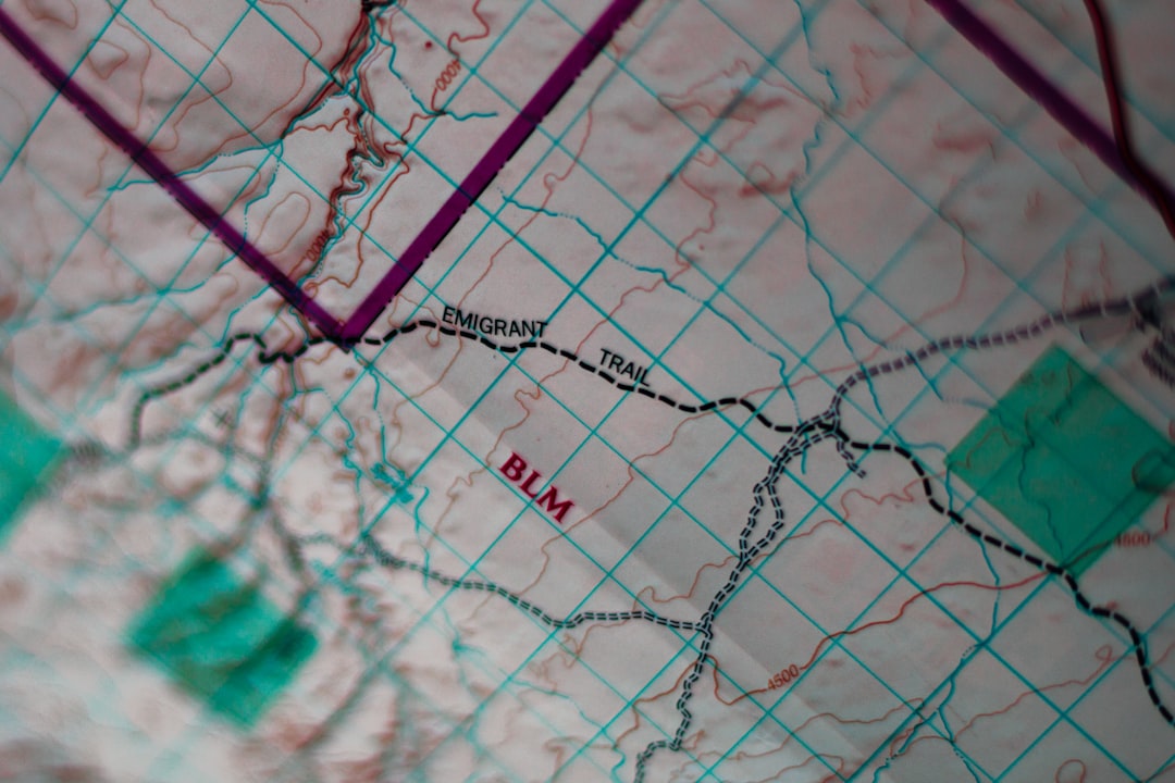
QGIS is free, open source, and far more powerful than browser-based route viewers. It supports GPX, KML, GeoJSON, Shapefiles, CSV coordinates, raster layers, and many database formats. You can clean tracks, reproject data, calculate distances, create buffers, join tables, and design print-ready maps.
The catch is the learning curve. Expect to waste time on coordinate reference systems if you are new to GIS. Still, QGIS is one of the most dependable choices when accuracy matters. Outdoor researchers, transport planners, survey teams, and logistics analysts often use it as the central workspace before publishing maps elsewhere.
- Pros: advanced analysis, offline use, broad format support.
- Cons: not beginner friendly, setup can feel heavy.
3. Kepler.gl
Best for: visual analysis of large movement and point datasets.
Kepler.gl, created by Uber’s visualization team, is strong when you need to inspect thousands or millions of location records. It works well with CSV, GeoJSON, and other structured data. Heatmaps, point clusters, arcs, trip animations, and time filters make it useful for mobility research and fleet analysis.
It is less ideal for casual users who just want to draw a weekend hike. Kepler.gl expects clean data with clear latitude and longitude fields. When the file is prepared well, though, the results are impressive and fast. It is especially useful for spotting traffic patterns, delivery density, or repeated GPS traces.
- Pros: strong visual filters, handles big datasets, excellent for time-based data.
- Cons: needs clean data, route editing is not its main purpose.
4. Mapbox Studio
Best for: custom branded maps and web applications.
Mapbox Studio gives developers and product teams tight control over map design. You can upload tilesets, style roads and terrain, add custom layers, and use Mapbox APIs to display routes in apps or websites. It is a good choice when the final map must match a brand, product interface, or public-facing dashboard.
Mapbox is not a quick GPX viewer in the same way GPS Visualizer is. You may need to convert files and prepare data before upload. Pricing also matters if traffic grows. For serious web projects, though, the design control is much better than most basic mapping tools.
- Pros: polished styling, strong developer tools, good for public maps.
- Cons: requires technical setup, costs can rise with usage.
5. Felt
Best for: collaborative web maps with a clean interface.
Felt is a modern mapping platform built for teams that need to mark up, discuss, and share maps quickly. It supports common geospatial data, has a smooth browser interface, and makes collaboration less painful than older GIS portals. Urban planning groups, nonprofits, field teams, and consultants can use it to review routes and locations together.
Felt is not as deep as QGIS for analysis. That is fine for many projects. Its value sits in communication. A map that stakeholders can open, understand, and comment on often beats a technically perfect file that sits in a folder.
- Pros: clean collaboration, easy sharing, good presentation quality.
- Cons: fewer advanced GIS tools than desktop software.
6. ArcGIS Online
Best for: enterprise GIS, government work, and controlled sharing.
ArcGIS Online is a strong option for organizations that need permissions, hosted feature layers, dashboards, and integration with Esri’s wider GIS system. It supports route maps, field data, live layers, survey results, and operational dashboards. For public agencies and large companies, those controls matter.
The main downside is cost and complexity. A simple GPS track can feel overbuilt inside ArcGIS Online. But if your team already uses Esri tools, this is often the safest route. User roles, auditability, and data governance are handled better than in most lightweight tools.
- Pros: enterprise controls, dashboards, strong GIS ecosystem.
- Cons: paid plans, more setup than casual users need.

7. uMap
Best for: open source web maps and quick public sharing.
uMap lets you create maps with OpenStreetMap layers and publish them online. It supports imports such as GeoJSON, KML, GPX, and CSV, making it a practical GPS Visualizer alternative for public route maps. You can style markers, lines, and polygons without installing software.
It is especially useful for community projects, local guides, cycling routes, and public interest maps. The interface is lighter than ArcGIS and less technical than QGIS. The tradeoff is that hosting and long-term reliability depend on the instance you use. For sensitive or high-traffic projects, check hosting details before committing.
- Pros: open source, OpenStreetMap based, quick publishing.
- Cons: less polished support model, instance reliability can vary.
Which Tool Should You Choose?
For a quick personal map, use Google My Maps or uMap. For data cleanup, measurement, and cartographic control, use QGIS. For large movement datasets, try Kepler.gl. For branded web maps, choose Mapbox Studio. For team review, use Felt. For enterprise GIS, choose ArcGIS Online.
A practical workflow often uses more than one tool. Clean GPX files in QGIS, export GeoJSON, then publish the final route in Felt, Mapbox, or uMap. That approach avoids the common trap of forcing one app to do everything.
Final Recommendation
If GPS Visualizer feels too limited, do not replace it blindly. Match the tool to the job. Small maps need speed. Professional route data needs control. Large GPS logs need filtering. Shared field projects need permissions and comments.
For most users, the best starting pair is QGIS plus a web publishing tool. QGIS handles the hard data work. Google My Maps, Felt, uMap, or Mapbox can handle distribution. That gives you cleaner routes, fewer upload surprises, and maps people can actually use.
Leave a Reply