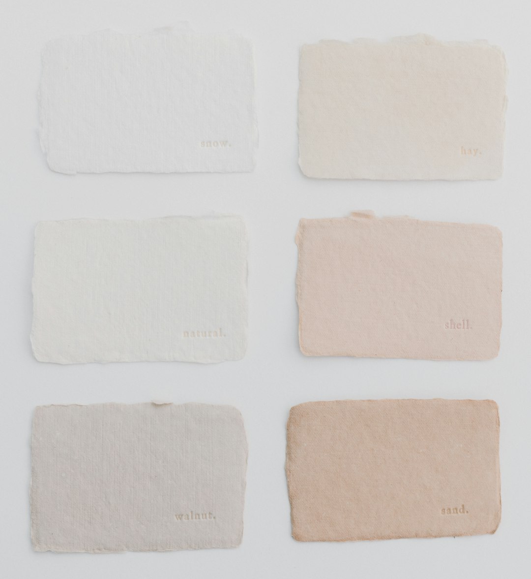
Use Adobe Color when your neutral UI palette needs precision, accessibility checks, and brand control; use Coolors when you need fast options and quick visual exploration. Neutral palettes look simple, but they are easy to ruin. A gray can turn blue. A beige can look dirty. A charcoal can crush contrast. The right color wheel tool helps you control those tiny shifts before they become expensive interface problems.
TLDR
Adobe Color is better for careful neutral systems, especially if you need contrast testing, harmony rules, and smooth handoff into Adobe apps. Coolors is better for speed, especially when you want to generate 20 gray, taupe, cream, or charcoal palette options in a few minutes. For example, a SaaS dashboard team testing five neutral palettes might spend 35 minutes in Adobe Color refining accessibility, while the same team could create 50 starting palette ideas in Coolors in under 10 minutes. A smart workflow is to brainstorm in Coolors, then validate the final palette in Adobe Color.
Neutral colors are not “colorless.” They sit near the center of most color models, with low saturation and controlled brightness. In UI design, they carry the page. They shape backgrounds, cards, dividers, borders, text, disabled states, and shadows. If your neutrals are weak, even a strong accent color will not save the interface.
A useful color wheel for neutral colors is less about rainbow picking and more about temperature. Cool grays lean blue. Warm grays lean brown or red. Creams lean yellow. Charcoals may carry green, violet, or navy undertones. These small shifts affect whether a product feels clinical, calm, premium, playful, or dated.
How Adobe Color Handles Neutral UI Palettes
Adobe Color feels built for designers who want control. Its color wheel supports harmony modes such as analogous, monochromatic, triad, complementary, and compound. For neutral palettes, monochromatic and shades are especially useful because they help create a structured scale from light backgrounds to dark text.
The best part is the sense of discipline. You can start with a base neutral, such as #F7F4EF, then adjust related tones without losing the family resemblance. Adobe Color also includes accessibility tools, which matters a lot for UI. A pale gray button label may look elegant in a mockup, then fail badly for real users.
Adobe Color works well for:
- Design systems with strict neutral scales.
- WCAG contrast checks for text and backgrounds.
- Brand palettes that need warm or cool undertones.
- Teams using Adobe apps such as Illustrator, Photoshop, or XD.
- Image extraction when you want neutrals from a photo or moodboard.
The catch is that Adobe Color can feel heavier than it needs to. It drives me crazy that a simple palette adjustment sometimes takes a few extra clicks compared with faster tools. If you are just trying to see whether warm stone or blue gray feels better for a login screen, that friction gets old quickly.
How Coolors Handles Neutral UI Palettes
Coolors wins on speed. Press the spacebar, and a new palette appears. Lock one color, spin the rest, and keep moving. That is excellent for neutral UI exploration because you often need to compare many tiny variations before one feels right.
For example, you might lock a soft background color like #FAFAF7, then generate related border, card, text, and muted accent colors. In a few minutes, you can test warm minimal, cool enterprise, editorial beige, dark mode charcoal, and soft clay themes.
Coolors is strongest for:
- Rapid palette generation during early concept work.
- Locking key colors while remixing supporting neutrals.
- Exporting palettes in formats designers and developers can use.
- Creating mood options for stakeholder reviews.
- Finding tasteful off whites, soft grays, and muted darks fast.
Honestly, Coolors feels better when you are still unsure. It encourages quick decisions and quick rejection. That matters with neutral palettes because many options look almost identical until you place them inside cards, tables, modals, and form fields.
Image not found in postmetaAdobe Color vs Coolors: The Practical Difference
The difference is not “professional versus casual.” Both tools can support serious UI work. The real split is control versus speed.
| Need | Better Tool | Why It Helps |
|---|---|---|
| Build a full gray scale | Adobe Color | Better for controlled tonal steps and harmony rules. |
| Generate many palette ideas | Coolors | Fast spacebar workflow and easy color locking. |
| Check readable text contrast | Adobe Color | Accessibility features are more central to the workflow. |
| Create stakeholder options | Coolors | Easy to produce varied neutral moods quickly. |
| Match an existing brand image | Adobe Color | Image extraction and Adobe library support help teams stay consistent. |
What Makes a Good Neutral UI Palette?
A strong neutral UI palette usually has more structure than people expect. Five random grays are not enough. You need a scale with clear roles.
A practical neutral palette might include:
- Page background: very light, such as warm white or soft gray.
- Surface color: card and modal background, slightly separated from the page.
- Border color: visible but quiet.
- Muted text: labels, helper text, timestamps, placeholders.
- Primary text: high contrast, usually near charcoal or black.
- Disabled color: subdued without becoming unreadable.
For light UI, a common structure is 95%, 90%, 80%, 60%, 30%, and 10% lightness. For dark UI, the same idea flips. You need enough separation between layers. Otherwise, cards blend into the background and users start hunting for edges.

Using a Color Wheel for Neutrals
When picking neutrals, think in three controls: hue, saturation, and brightness. Hue sets the temperature. Saturation keeps the color quiet. Brightness sets the UI role.
In Adobe Color, start with a base neutral and use harmony modes to keep the set related. Then check contrast for text sizes. In Coolors, start broader. Generate options, lock the colors you like, and remove anything that feels muddy or too tinted.
A simple workflow works well:
- Pick a temperature: cool gray, warm gray, beige, greige, slate, or charcoal.
- Create a six step neutral scale: from background to main text.
- Add one accent color: blue, green, orange, violet, or brand color.
- Test real components: cards, tables, buttons, alerts, forms, and menus.
- Check contrast: especially for labels, placeholder text, and disabled buttons.
Which Tool Should You Choose?
Choose Adobe Color if your UI palette must last. It is the better pick for design systems, accessibility review, and brand consistency. It also suits teams already using Adobe Creative Cloud.
Choose Coolors if you are still searching for the mood. It is the better pick for early product concepts, landing pages, quick mockups, and client options. It keeps you moving when perfection would slow you down.
The best answer is often both. Use Coolors to explore neutral directions fast. Then move the strongest palette into Adobe Color for contrast checks, refined relationships, and final polish. That workflow gives you speed first, then confidence before the palette reaches production.
Leave a Reply